
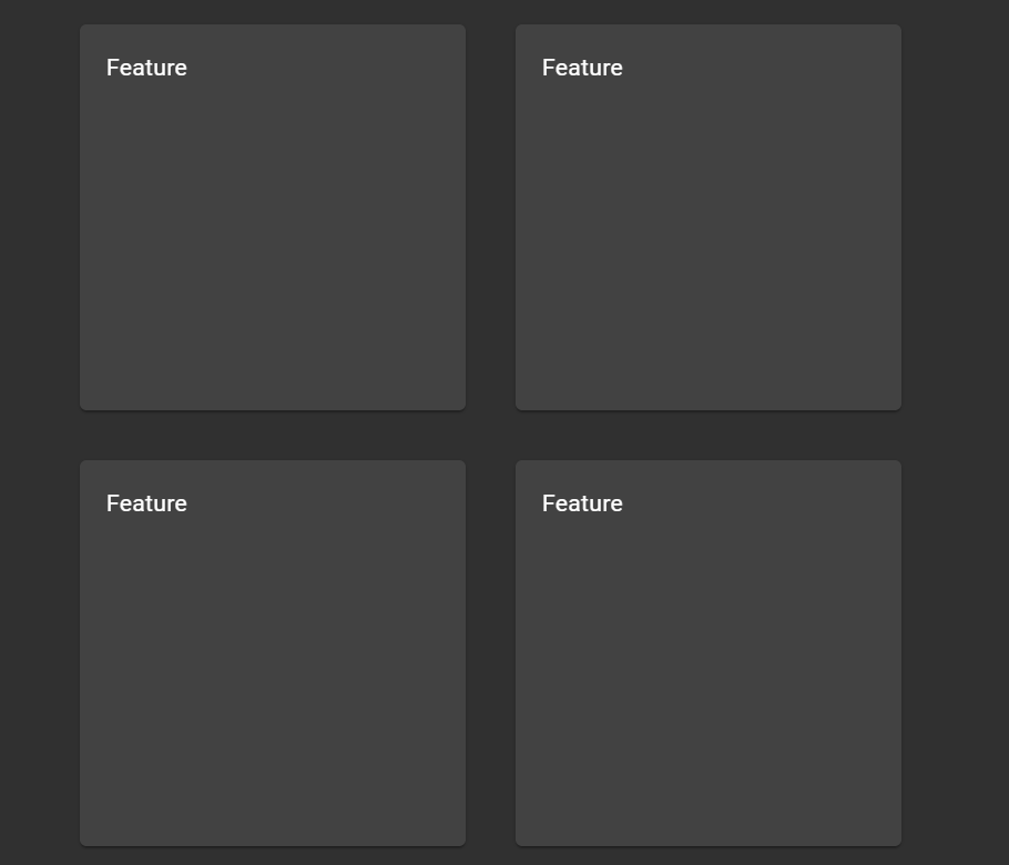
So, a key part of the landing page is to excite the viewer into signing up. To do this I need to get the main features of the app over to the user in a clean and simple way. To me, the best way I like to see features at a quick glance is in some simple cards so that’s what I will build.
Creating the basic outline for the cards in Angular is nice and simple. The HTML for the features component contains a main div and then each card contains a container, the example below only has 4 cards.
<div class="featuresMain">
  <div class="fCardCont">
    <mat-card class="fCardClass">
      Feature
    </mat-card>
  </div>
  <div class="fCardCont">
    <mat-card class="fCardClass">
      Feature
    </mat-card>
  </div>
  <div class="fCardCont">
    <mat-card class="fCardClass">
      Feature
    </mat-card>
  </div>
  <div class="fCardCont">
    <mat-card class="fCardClass">
      Feature
    </mat-card>
  </div>
</div>
.featuresMain {
  display: flex;
  align-items: center;
  justify-content: center;
  flex-wrap: wrap;
  margin: 20px;
}

.fCardCont {
  padding: 15px;
}

.fCardClass {
  width: 200px;
  height: 200px;
}
Now I don’t want these cards to be boring and static so I think a neat idea would be to make them rotatable cards when the user hovers over them more info would be shown on the back.
w3 schools has a neat little example card for how to do the flip in CSS https://www.w3schools.com/howto/howto_css_flip_card.asp
The code didn’t need to change to much to get this working.
  <div class="fCardCont">
    <div class="fCardContInner">
      <div class="fCardClass_front">
        <mat-card class="card">
          Front
        </mat-card>
      </div>
      <div class="fCardClass_back">
        <mat-card class="card">
          Back
        </mat-card>
      </div>
    </div>
  </div>
.fCardCont:hover .fCardContInner {
  transform: rotateY(180deg);
}

.fCardCont {
  width: 200px;
  height: 200px;
  perspective: 1000px;
}

.fCardContInner {
  position: relative;
  width: 100%;
  height: 100%;
  transition: transform 0.8s;
  transform-style: preserve-3d;
}

.fCardClass_front {
  position: absolute;
  width: 100%;
  height: 100%;
  -webkit-backface-visibility: hidden; /* Safari */
  backface-visibility: hidden;
}

.fCardClass_back {
  position: absolute;
  width: 100%;
  height: 100%;
  -webkit-backface-visibility: hidden; /* Safari */
  backface-visibility: hidden;
  transform: rotateY(180deg);
}

.card {
  width: 100%;
  height: 100%;
  box-sizing: border-box;
}
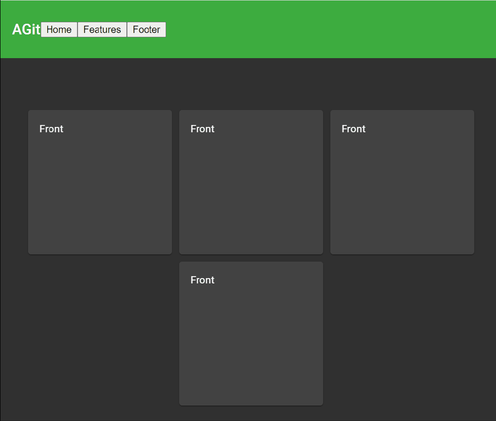
I like the overall feel of these cards and will use them going forward.
Categories: ezConsole
 greenchapel.dev
Leave a comment